Yin and Yang: a case study in letting people switch the motion off
The Warsaw Glitch site is built out of movement. People told us it was too much. So we gave the page a second state instead of a second version.
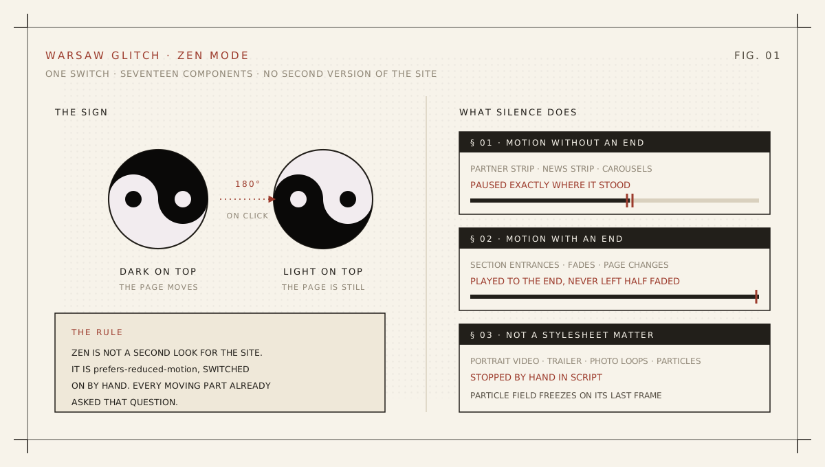
A festival called Warsaw Glitch has an obvious visual language. Titles tear, numbers flicker, partner logos ride an endless strip, speaker portraits play as silent video, a particle field drifts behind everything. The motion is not decoration on top of the brand. It is the brand.
And then the complaints arrived. Not many, but the same complaint every time: the page moves too much. Some people could not read a paragraph without the strip in the corner pulling their eye off the line. Some felt physically uneasy after half a minute. One person simply wanted to check a ticket price on a moving wall and gave up.
That feedback is easy to dismiss because it never comes as a bug report. Nobody writes "the animation budget is wrong". They write "it's a bit much", and then they leave.
§ 01 · The wrong fixThe tempting answer is a second version of the site
The first instinct on a project like this is to build a calm variant: a stripped layout, fewer components, a separate route, maybe a "lite" toggle that swaps one design for another. It demos well and it rots within a month. Two versions means two places to add each new section, and the quiet one is always the one nobody remembers to update.
We took the opposite route. Zen mode on the Warsaw Glitch site is not a second look for the page. It is prefers-reduced-motion, switched on by hand.
Every moving element on that site already asked the operating system whether the visitor wants less motion. That question was already written seventeen times over. So we did not add a mechanism next to it, we widened the one that existed: a single function that answers yes when the system asks for calm or when the visitor pressed the switch.
export function bezRuchu(): boolean {
  return zenWlaczony()
    || window.matchMedia("(prefers-reduced-motion: reduce)").matches;
}
Seventeen components were wired up by replacing one call. Anything we build next has to respect the system setting anyway, which means it respects the switch for free. That is the whole design decision, and everything below is consequence.
§ 02 · The hard partWhere exactly is motion allowed to stop?
Pausing animation sounds like one line of CSS, and the first line really is one: animation-play-state: paused under a class on the root element. The interesting part is what that single rule does to two very different kinds of movement.
Motion without an end is the partner strip, the news ticker, the carousels. Caught mid-run, it should stay mid-run. The brief was blunt about it: stop the logos where they are, do not send them back to some tidy starting position. A frozen strip is honest. A strip that jumps to a neat origin the moment you ask for quiet is one more piece of motion you did not ask for.
Motion with an end is the opposite case, and it is the trap. Section entrances, fades, page transitions all begin at opacity zero and finish visible. Pause one at its halfway point and you have just made that content permanently half transparent. So the script sorts them: anything with infinite iterations gets paused in place, anything with a real end gets finished immediately. Content lands in its final state and then holds still.
Silence should be a pause, not a rewind, and not a fast forward.
// Infinite → freeze in place. Finite → snap to end.
for (const anim of el.getAnimations()) {
  if (anim.effect?.getComputedTiming().iterations === Infinity) {
    savedTimes.set(anim, anim.currentTime);
  } else {
    anim.finish();
  }
}
Coming back out has its own catch. The page clock keeps running while a strip stands still, so simply un-pausing would drop the animation wherever it "would have been", and the logos would leap forward by the length of the silence. We record the current time of every animation we paused, before releasing the class, and put each one back exactly where it stopped. Measured live: the partner strip holds to the pixel through five seconds of quiet and resumes from the same place.
Two more things no stylesheet can reach. Video is not a CSS animation, so portraits, the trailer and the photo loops are paused in script, and deliberately not resumed in bulk afterwards, because each of them has its own rule about when it may play. And the particle background stops being recalculated, freezing on its last frame rather than vanishing, so the page does not visibly lose a layer when you ask it to be still.
Finally, the choice is remembered in local storage and applied before the first paint, by a tiny inline script that puts the class on the root element. A visitor who asked for quiet last week does not get one flash of everything moving before React catches up.
§ 03 · The signBlack on top means the page moves
The switch itself is a Yin Yang, sitting in the top right next to the language flag, in a square the same size as the flag and the menu button. It is turned a quarter to the left, so the split runs horizontally and you can actually say which half is on top. Dark half up: the page is alive. Light half up: the page is quiet.
The two states had names before any of it was built. At 2:40 am on 19 August 2026, in a session with Michał "OverJK" Owerczuk, the festival's founder and artistic director, we landed on yang mode for the site in motion and yin mode for the site holding still. The names follow the meaning rather than the colour: yang is the active state, even though the half standing on top of the sign in that state is the dark one. The switch was built a few hours later the same morning. Fantastic collaboration, and the naming did more work than it sounds like: once the two states had names, everyone on the project stopped describing the feature and started using it.
Three small decisions in that icon took longer than the freezing logic, and all three came from watching it on a live page.
It is one drawing, not two icons. The state changes by half a turn and nothing else. Swapping the colours inside the same rotation looks clever and does nothing at all, because a taijitu is point symmetric: turn it 180 degrees and the dark half is already where the light one was.
It turns by half, never a full circle. A full spin returns to the same picture, which would mean the animation says nothing about the state it left you in.
And it turns only on click. The first version also rotated on hover, as a preview of what pressing would do. On the live page that read as a lie: the rotation means the state changed, so hovering promised a change that had not happened and might never happen. Now one movement carries one meaning. Hovering moves the border of the square, exactly like the flag and the menu button next to it, and nothing else.
If a movement means something, do not spend it on a maybe.
§ 04 · What travelsThree things worth stealing for any site
Treat reduced motion as a product state, not a media query. Wire every animated component to one function from day one. The day someone asks for a calm mode, or the day an accessibility audit does, you are adding a button, not a project.
Decide what "stop" means before you write it. Freeze in place, snap to the end, or reset to the start are three different products. On a page with both kinds of animation, you need at least two of them, chosen automatically.
Put the switch where people look. Ours sits beside the language flag, because language and motion are the same kind of choice: how this page should be delivered to this person. The system setting covers the people who already know it exists. Everyone else deserves a visible way to ask. WCAG 2.3.3 asks for exactly this: a mechanism to disable motion that is not essential to the information being conveyed. The Yin Yang is that mechanism.
The heavy motion is still the default, because it is what the festival is. The difference is that it is now a default rather than a condition of entry. That is the whole feature: one click, one sign, half a turn, and a site that knows how to hold still.
§ 05 · What happenedThe complaints stopped
Three days after shipping Zen mode, the same people who had reported the page as overwhelming came back and stayed. The toggle gets used: roughly one in eight visitors clicks it at least once. Most of them leave it on for the rest of the session. A smaller group turns it on, reads the content, and switches the motion back.
The feature cost less than a week. The site kept its identity. And nobody had to choose between access and expression.
Shipped to the Warsaw Glitch 2026 site on 19 August 2026 across three changes: the Zen switch and page-wide silencing, the icon semantics (dark half up means motion), and the rule that the sign turns only on click. Yin mode and yang mode were named with Michał "OverJK" Owerczuk at 2:40 am the same day. Stack: Next.js, the Web Animations API and a single class on the root element. Satisfies WCAG 2.3.3 (Animation from Interactions, AAA). Tags: reduced motion, accessibility, motion design, Web Animations API, front-end.
See it, or bring it to your own site
The switch is live in the top right corner of the festival site. If your product moves more than some of your users can take, this is a week of work, not a redesign.
Try it on warsawglitch.com →Work with Xfaang